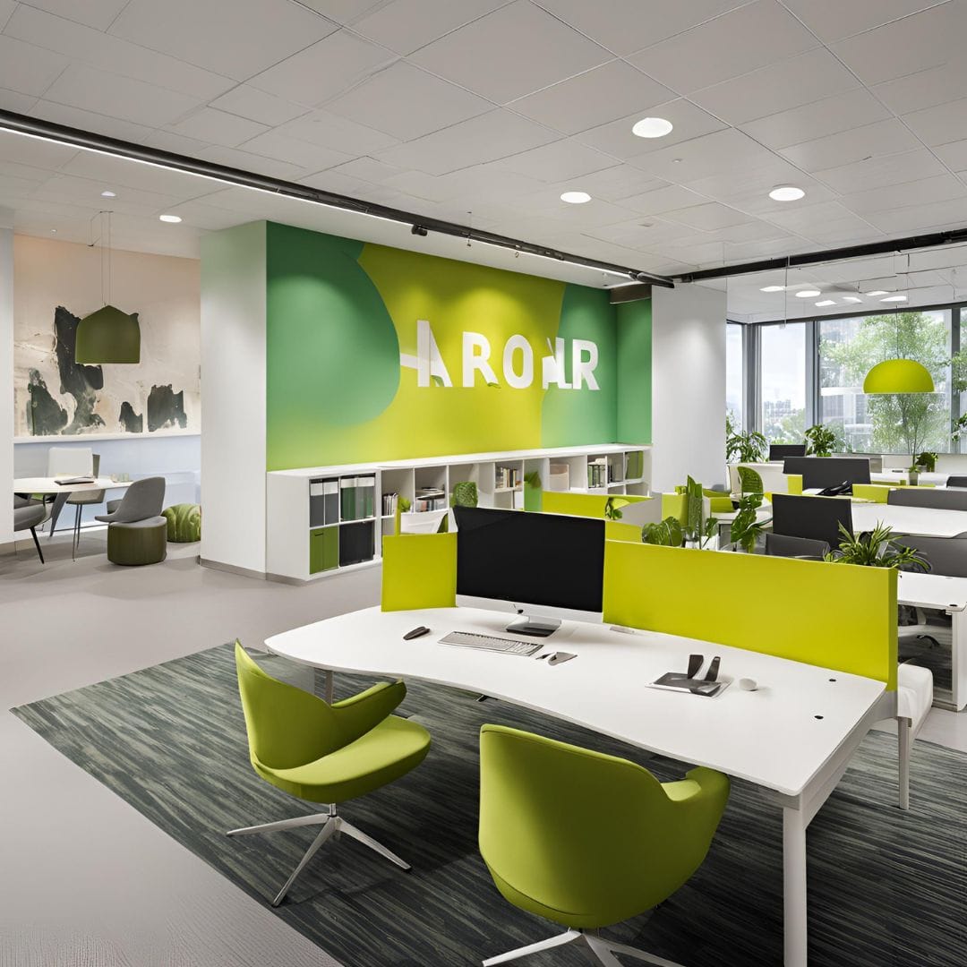
Mastering Office Interiors: 10 Essential Tips for Harmonizing Brand Colors
In today’s highly competitive business landscape, establishing a strong brand identity is crucial for success. One often overlooked aspect of branding is harmonizing brand colors within office interiors. The colors used in the workplace not only reflect the company’s visual identity but also significantly impact the overall work environment and employee productivity. This article delves into the importance of harmonizing brand colors in office interiors and provides valuable insights into implementing effective color schemes.
Importance of Harmonizing Brand Colors in Office Interiors
Enhancing Brand Identity
Brand colors are an integral part of a company’s visual identity. Consistency in using these colors throughout the office space reinforces brand recognition and instills a sense of trust and familiarity among employees, clients, and visitors. A well-established brand identity also differentiates the company from its competitors.
Creating a Positive Work Environment

Colors have a profound psychological impact on individuals. Harmonizing brand colors in office interiors can create a positive and inspiring work environment. Warm colors like orange and yellow evoke feelings of enthusiasm and energy, while cool colors like blue and green promote a sense of calmness and relaxation. Striking the right balance can significantly influence the mood and well-being of employees.
Impact on Employee Productivity
The color scheme in the workplace can have a direct impact on employee productivity. Colors that complement the nature of the work being done can enhance focus and concentration. For example, creative industries may benefit from vibrant colors that encourage innovation, while corporate settings may opt for sophisticated and muted tones that promote professionalism.
Understanding Color Psychology

Before harmonizing brand colors, it’s essential to grasp the fundamentals of color psychology. Colors play a significant role in influencing human emotions and perceptions, making it crucial to choose the right ones for branding purposes. Warm colors like red and yellow exude energy and passion, evoking a sense of urgency and fostering creativity. In contrast, cool colors like blue and green evoke feelings of tranquility and harmony, promoting stability and a sense of calmness.
Each color carries its own symbolism and associations, impacting how people perceive a brand or product. For instance, blue often conveys trust, reliability, and productivity, while green is linked to growth, health, and nature. On the other hand, red symbolizes power, passion, and excitement. Understanding these color associations can empower businesses to make informed and strategic choices when it comes to their brand identity and visual representation.
Factors to Consider When Harmonizing Brand Colors
Several factors should be taken into account when harmonizing brand colors within office interiors.
Company Logo and Visual Identity

The company’s logo and visual identity should serve as a foundation for selecting Office interior colors. Incorporating these colors throughout the workspace ensures consistency and strengthens the brand’s presence.
Nature of Work and Company Culture
The nature of work and the company’s culture play a significant role in color selection. For example, technology-oriented firms might opt for modern and bold colors to reflect innovation, while traditional companies may prefer classic and muted tones.
Employee Preferences and Feedback
Involving employees in the decision-making process fosters a sense of ownership and satisfaction. Conducting surveys or seeking feedback from team members regarding color preferences can lead to a more inclusive and harmonious Office interior.
Implementing Harmonized Color Schemes
Implementing harmonized color schemes involves careful consideration of various elements within the office space.
Wall Colors and Paintings
The walls serve as the canvas for the color scheme. Choosing the primary wall color that aligns with the brand is essential. Additionally, incorporating paintings or artwork that feature the brand colors can add aesthetic appeal.
Furniture and Decorations
Office furniture and decorations should complement the chosen color scheme in Office interior. This includes desks, chairs, shelves, and decorative elements like plants and artwork. Cohesiveness in design enhances the overall visual impact.
Lighting and Accessories

Proper lighting can accentuate the chosen colors and set the desired ambiance in Office interior. It is crucial to strike a balance between natural and artificial lighting to create an inviting and comfortable atmosphere. Accessorizing with brand-colored items like rugs, cushions, or curtains can further reinforce the color theme.
The Psychological Impact of Harmonized Colors

The psychological impact of harmonized colors can be profound.
Boosting Employee Morale
Colors that evoke positive emotions can boost employee morale, leading to increased job satisfaction and reduced stress levels.
Fostering Creativity and Innovation
Certain colors in Office interior are known to stimulate creativity and innovative thinking. Incorporating such colors in brainstorming areas or creative spaces can enhance the flow of ideas.
Improving Client Impressions
Harmonized brand colors also leave a lasting impression on clients and visitors. A well-designed office space reflects professionalism and attention to detail.


