Interior Design 2025 Color Trends
Introduction
Interior Design Colors are an important factor to consider. They make a room look big or small. Colors also change how people feel. Soft colors like blue and green make people calm. Bright colors like red and yellow give energy. Over time, color trends change, and new styles come. Choosing the right colors makes a home beautiful and comfortable.
Predicted Color Palettes for 2025

For 2025, warm earth tones will be popular. These colors like brown, beige, and terracotta make rooms feel cozy and calm. They are perfect for living rooms and bedrooms. The following are some of the interior design color palettes that will be popular in 2025.
- Earthy Warmth
- Rich Reds and Purples
- Natural Neutrals
- Cheerful Warmth
- Calming Blues
Earthy Warmth

Earthy Warmth colors create a cozy and natural feel in any space. It consists of the following shades:
- Terracotta
- burnt orange
- sandy beige
It brings warmth and comfort. These tones work well in living rooms and bedrooms, making them feel inviting.
They pair beautifully with wooden furniture and soft textures like wool or linen. This palette is perfect for a relaxed and timeless interior.
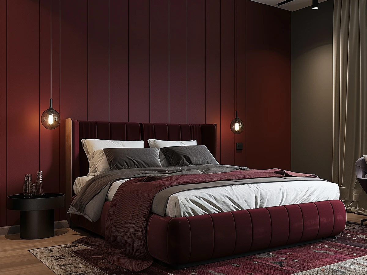
Rich Reds and Purples

Rich Reds and Purple are bold interior design colors that add luxury and depth to any space. It includes:
- Deep Burgundy
- Royal Purple
- Plum
These colors work well in dining rooms, bedrooms, or accent walls to make a strong statement. Pair them with gold or silver decor for a sophisticated touch. This palette is perfect for those who love a rich and stylish interior.
Natural Neutrals

Natural Neutrals are timeless interior design colors that create a calm and balanced space. It consists of:
- Beige
- Taupe
- Soft gray
- Off-white
These colors work well in any room, giving a clean and modern look. They pair well with wooden furniture and natural textures like linen and wool. This palette is perfect for a simple, elegant, and relaxing home design.
Cheerful Warmth

Cheerful Warmth brings a bright and lively interior design. It has shades like:
- Warm Yellow
- Coral
- Peach
These colors work best in living rooms, kitchens, and kids’ rooms to add energy. They pair well with white or soft neutrals to keep the space balanced. This palette is perfect for making a home feel warm, vibrant, and full of life.
Calming Blues

Calming blues are soothing interior design colors that create a peaceful and relaxing space. The colors are the following:
- Sky Blue
- Aqua
- Deep Navy
These colors work best in bedrooms, bathrooms, and reading areas for a tranquil atmosphere. They pair beautifully with white, soft grays, and natural wood tones. This palette is perfect for a serene and refreshing home design.
Walls vs. Accessories in Color Design
When designing with colors, know when to be bold with walls and when to use accessories. To create a strong impression, opt for a vibrant hue such as deep blue or red on your wall.
For a more harmonious appearance, incorporate bright shades through accents like cushions or drapes. Color can also be introduced through furniture, rugs, and decorative items, which can unify the room without being overly intense.
In compact areas, lighter tones are more effective in making the space appear larger. In large spaces, darker tones can make the room feel cozier.
Timeless vs. Trendy Colors

Timeless colors are classic shades that never go out of style. Colors like white, gray, and beige are always popular. They work in any room and with any furniture.
To follow trends without changing everything all the time, you can add modern interior design colors to accessories. This way, you can keep your space fresh without having to repaint. Mixing timeless colors with trendy ones creates a balanced look.
For example, use a classic color for the walls and add trendy colors with rugs or cushions. This keeps your space modern but still lasting.
Using Patterns and Textures with Colors
Textures can make colors look even better. For example, a soft velvet cushion in a rich color looks more luxurious. In modern interior design, simple patterns like stripes, geometric shapes, or dots work well. They add style without being too busy.
To make a room look balanced, combine prints with solid colors. For instance, a printed rug can match a plain-colored sofa. This mix makes the space feel interesting and not overwhelming.
Mistakes to Avoid in Interior Design Colors Selection

When selecting colors for a room, try to limit the use of overly bright shades. Too much vibrancy can create a disconcerting environment. Consider the lighting as well as the size of the space.
Dark tones might make small areas feel even more constricted, while lighter shades can create the illusion of a more expansive space. Furthermore, it’s essential to make sure the colors complement your furniture.
Colors that clash can result in a chaotic look in the room. Always aim to maintain a balance in the colors for an attractive appearance.
How Rady Interior Can Help
RadyInterior can help by offering expert color consultation services. We will suggest the best interior design colors for your home or office. Our team provides personalized design solutions to make every space unique and beautiful.
Whether you want timeless colors or the latest trends, we have great ideas for you. We will ensure that your space looks stylish and fits your needs. RadyInterior can help make your design dreams come true with the perfect colors.
Conclusion
In 2025, the trends in interior design colors will spotlight warm earth tones, vibrant jewels, and gentle pastels. It’s an excellent opportunity to play around with contemporary shades to achieve a refreshed aesthetic in your space. Don’t hesitate to blend various colors to discover what suits you best.
The essential aspect is to harmonize the colors to create a space that feels cozy and welcoming. With the appropriate color choices, you can elevate any room into something extraordinary.

Modern Kitchen Design in Dubai: Master Open Layouts & Bespoke Cabinetry
Modern kitchen design in Dubai is evolving toward open layouts, bespoke cabinetry, and durable luxur

Modern Pantry Room Ideas That Elevate Your UAE Kitchen Experience
A well-planned pantry turns busy UAE kitchens into calm, efficient hubs. With space at a premium in

Modern Kitchen Trends 2025 in Dubai: A Complete Guide
Dubai is famous for its luxury and new ideas in design. In 2025, kitchens in Dubai will mix modern,