Color Theory 101: How Color Changes Amazingly Our Lives
Introduction
Color is a fundamental element in the world of design, playing a crucial role in evoking emotions, setting moods, and creating visually captivating compositions. At the heart of effective color usage lies color theory, a field that combines both artistry and science to understand how colors interact and influence one another. This article delves into the fascinating realm of color theory, unraveling its principles and exploring its significance in various design disciplines. Join us on a journey to discover the foundations of color theory and how it can be applied to create harmonious and aesthetically pleasing compositions.
Understanding the Color Wheel
Central to color theory is the concept of the color wheel, a visual representation of the spectrum of colors. The color wheel consists of primary, secondary, and tertiary colors, each serving as building blocks for creating an array of hues and shades.
- Primary Colors
- Primary colors, including red, blue, and yellow, are pure and cannot be created by mixing other colors. They form the foundation for all other colors on the wheel.
- Secondary Colors
- By combining two primary colors, we obtain secondary the following: orange, green, and purple. Secondary colors lie between the primary colors they are derived from on the color wheel
- Tertiary Colors
- Tertiary colors are formed by mixing a primary color with a neighboring secondary color. Examples include red-orange, yellow-green, and blue-violet. Tertiary colors provide a wider range of shades and tones, adding depth and complexity to color compositions.
Color Harmony and Scehemes

Color harmony refers to the pleasing combination of colors within a composition. Achieving color harmony involves understanding various color schemes and their relationships.
- Complementary Colors
- Complementary colors are located opposite each other on the color wheel. When paired together, they create a striking contrast and enhance each other’s intensity. Examples include blue and orange, red and green, and yellow and purple.
- Analogous Colors
- Analogous colors are adjacent to each other on the color wheel. They share similar undertones and create a harmonious and cohesive visual effect. An example would be combining blue, blue-green, and green.
- Triadic Colors
- Triadic color schemes involve three colors that are evenly spaced on the color wheel. This creates a balanced and dynamic composition. Examples of triadic schemes are red, yellow, and blue or orange, green, and purple.
- Monochromatic Colors
- Monochromatic color schemes focus on variations of a single color. By using different shades, tints, and tones of one color, designers can create depth and visual interest while maintaining a sense of harmony.
The Impact of Color in Interior Design
Colors have the power to evoke specific emotions, influence mood, and communicate messages. Understanding the psychological and cultural associations of colors allows designers to create intentional and impactful compositions.
- Warm Colors:
- Warm colors, such as reds, oranges, and yellows, are associated with energy, passion, and warmth. They can create a sense of excitement and draw attention.
- Cool Colors:
- Cool colors, including blues, greens, and purples, are often perceived as calming, soothing, and serene. They evoke feelings of relaxation and can create a sense of spaciousness.
- Neutral Colors:
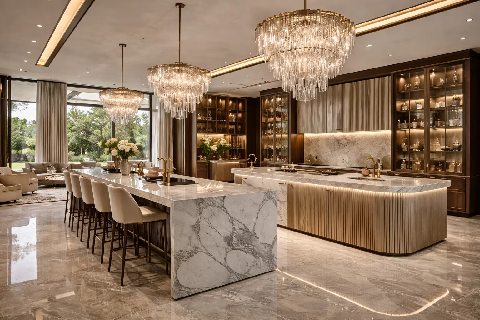
- Neutral colors, such as whites, grays, and beiges, are versatile and often serve as a backdrop to other colors. They provide balance, enhance other hues, and create a sense of elegance and sophistication.
Applying Color Theory in Interior Design
The color theory finds applications in various design disciplines, including graphic design, interior design, fashion design, and more. By understanding color relationships, designers can create visually pleasing compositions that effectively communicate their intended messages.
In graphic design, color theory is essential for creating impactful logos, advertisements, and visual identities. The choice of colors can influence brand perception and effectively convey brand values.
In interior design, color theory guides the selection of paint colors, textiles, and furnishings. It helps designers create atmospheres that align with the desired mood and function of a space.
In fashion design, color theory plays a crucial role in fabric selection, pattern creation, and styling choices. Colors can evoke emotions, express individuality, and communicate fashion trends.
Conclusion
The theory is a fascinating field that explores the relationships, harmonies, and emotional impact of colors. By understanding the principles of the wheel, harmony, and the psychological associations of colors, designers can unleash their creative potential and create visually captivating compositions. Whether you’re a graphic designer, interior designer, or fashion enthusiast, embracing color theory can elevate your work to new heights, allowing you to effectively communicate messages, evoke emotions, and create harmonious visual experiences. Embrace the art and science of color theory, and let your creativity flourish with the limitless possibilities of color.


